About me
As a passionate graphic designer hailing from the vibrant city of Orlando, Florida, I bring a unique blend of creativity and innovation to my work. With a deep appreciation for the power of visual communication, I strive to create designs that captivate and inspire. Drawing inspiration from the dynamic energy of my surroundings, I infuse my designs with a touch of Florida’s eclectic charm. With a strong foundation in design principles and a keen eye for detail, I am committed to delivering exceptional results that exceed client expectations. Whether it’s crafting a captivating logo, designing an engaging website, or creating visually stunning marketing collateral, I am dedicated to bringing my clients’ visions to life while adding my own artistic flair. With each project, I aim to create meaningful and impactful designs that leave a lasting impression.
Logo Designs
Throughout my career as a graphic designer, I have had the privilege of creating a diverse range of logos for various clients. Each logo design was a unique and exciting challenge that allowed me to showcase my creativity and expertise. From working with small businesses to large corporations, I have crafted logos that capture the essence of their brand identities. Whether it was designing a sleek and minimalistic logo for a tech startup or creating a playful and vibrant logo for a children’s brand, I always focused on understanding the client’s vision and translating it into a visually compelling design. It has been immensely gratifying to see how these logos have helped businesses establish a strong visual presence and effectively communicate their values to their target audience.


Portfolio
My graphic design portfolio showcases my passion for creative expression and my expertise in visual communication. With a carefully curated selection of my best work, it highlights my versatility, attention to detail, and ability to create compelling designs across various mediums. From logo designs and branding projects to illustrations and digital artwork, my portfolio reflects my unique style and ability to bring ideas to life. Each project demonstrates my understanding of client needs, as well as my commitment to delivering visually impactful solutions. Whether it’s through typography, color palettes, or composition, my portfolio is a testament to my dedication to the craft of graphic design.
LiveEvil
For the LiveEvil clothing company, the brand design you created is a perfect representation of the brand’s edgy and rebellious spirit. The logo features a bold and modern font that is both recognizable and memorable. The color palette of Blue, pink, and black gives the brand a powerful and distinctive look that stands out in a crowded market. The design also includes unique graphics and typography that capture the essence of the brand and appeal to its target audience. Overall, the brand design successfully captures the energy and attitude of LiveEvil and sets it apart from other clothing brands in the industry.

Problem:
One of the branding problems that LiveEvil Streetwear may encounter is standing out in a saturated market. Streetwear has become a popular fashion trend, with many brands vying for the attention of the same demographic. Therefore, LiveEvil Streetwear will need to differentiate itself from its competitors by creating a unique brand identity that resonates with its target audience. Another branding problem could be the perception of the brand as too edgy or controversial, which may limit its appeal to a wider audience. Thus, LiveEvil Streetwear will need to strike a balance between being bold and provocative while remaining socially acceptable.
Solution:
LiveEvil Streetwear is a fashion brand that caters to individuals who enjoy edgy and alternative clothing. When creating a branding solution for LiveEvil Streetwear, it is important to ensure that the design effectively conveys the company’s values and message to its target audience. The visual identity should be bold, rebellious, and memorable, reflecting the brand’s edgy personality. The typography and color scheme should be carefully chosen, reflecting the brand’s attitude and style. Additionally, the use of striking graphics and imagery can help to create a memorable and consistent visual identity that resonates with LiveEvil Streetwear’s target audience. Overall, the branding solution should capture the essence of the brand and its message, while also being visually appealing and memorable.
My Role:
As a branding solution for LiveEvil Streetwear, I suggested creating a visual identity that reflects the brand’s edgy personality through the use of striking graphics and imagery. The design features a bold and playful logo that incorporates the brand’s name in a unique way, along with a color scheme that is both eye-catching and memorable. The overall design is intended to effectively convey the company’s values and message to its target audience while being visually appealing and memorable. The end result is a brand design that is both distinctive and captivating, perfectly suited to the unique offerings of LiveEvil Streetwear.


edibu
I recently had the opportunity to work on a brand design project for Edibu, a mobile app company. The goal was to create a brand identity that would reflect their innovative approach and resonate with their target audience. After conducting extensive research, I crafted a design concept that combined modern aesthetics with a sense of simplicity. The logo I created featured a sleek, minimalistic design with an abstract icon representing connectivity and forward-thinking. The color palette consisted of vibrant shades, symbolizing energy and creativity. To ensure brand consistency, I developed a set of visual elements, including typography and graphic elements. The final brand design for Edibu successfully captured their essence and positioned them as a dynamic and cutting-edge player in the mobile app industry.

Problem:
One of the branding problems faced by the mobile app company edibu is a lack of differentiation in the market. With numerous app companies competing for attention, it becomes crucial for a brand to stand out and offer something unique. Edibu may struggle to differentiate itself from competitors, resulting in a diluted brand identity and a reduced ability to attract and retain users. Additionally, if the brand messaging and positioning are unclear or inconsistent, it can lead to confusion among the target audience and hinder brand recognition. Without a strong and distinct brand image, edibu may find it challenging to establish a loyal customer base and gain a competitive edge in the highly saturated mobile app industry.
Solution:
edibu, a mobile app company, can benefit from a strong branding solution to establish its presence in the competitive market. A well-crafted brand identity will help edibu differentiate itself from its competitors and create a lasting impression on its target audience. Firstly, a captivating logo that embodies the essence of the company’s values and vision should be designed. This logo can then be incorporated consistently across all marketing materials, including the app interface, website, and social media profiles. Alongside the logo, a unique color palette and typography should be chosen to convey the desired brand personality. Additionally, a compelling brand story and messaging strategy should be developed to engage users and build trust. This can be achieved through clear and concise communication that highlights the app’s key features, benefits, and user experience. By implementing a comprehensive branding solution, edibu can strengthen its market presence and establish itself as a reliable and innovative mobile app company.
My Role:
As a graphic designer, my role in creating a brand identity for edibu, is both exciting and challenging. I was responsible for visually translating the company’s values and vision into a captivating logo that will serve as the face of the brand. It was my job to carefully select colors, typography, and design elements that resonate with edibu’s target audience and convey the desired brand personality. With every design decision, I strived to create a cohesive and visually appealing brand experience that sets edibu apart from its competitors. Additionally, I played a vital role in designing marketing materials such as app interfaces, website layouts, and social media graphics that effectively communicate the brand story and engage users. By leveraging my creativity, attention to detail, and design expertise, I am dedicated to contributing to the success of Edibu’s brand identity and helping the company establish a strong presence in the mobile app market.


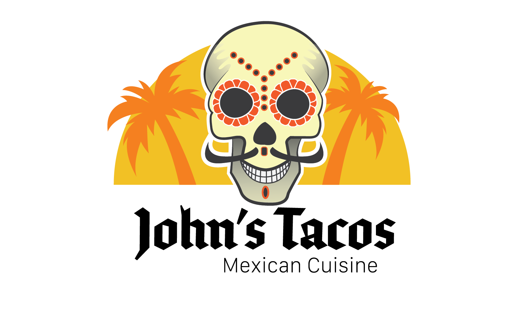
John’s Tacos
John’s Tacos is a popular restaurant that serves mouth-watering tacos with a variety of fillings, featuring fresh and flavorful ingredients. The menu offers options for all tastes, from classic beef tacos to vegetarian options. Customers rave about the generous portions and affordable prices, making John’s Tacos a go-to spot for a quick and delicious meal on the go. The tacos are made with warm, soft tortillas stuffed with juicy meats and fresh salsa, making them stand out from the competition. John’s Tacos is a must-visit for anyone who loves delicious and authentic Mexican food.

Problem:
Creating a brand for a company called John’s Tacos can be a challenging task. The brand needs to capture the essence of the company and set it apart in the highly competitive food industry. The brand design needs to appeal to the target audience and convey the company’s values and personality. It is important to consider the color palette, typography, and graphics that will be used in the brand design. The brand needs to be easily recognizable and memorable, and it should evoke a sense of trust and authenticity in the minds of consumers. Overall, creating a successful brand for John’s Tacos requires careful planning, research, and creativity.
Solution:
As a graphic designer, my role in creating a brand for John’s Tacos would be to develop a visual identity that effectively communicates the essence of the business to its target audience. This would involve understanding the company’s values and message and translating them into a design that captures the attention of potential customers. A successful branding solution would convey the uniqueness of John’s Tacos, differentiate it from competitors, and establish a strong emotional connection with the audience. Whether it’s through the choice of colors, typography, or imagery, the brand design must be memorable, eye-catching, and consistent across all platforms to create a cohesive and recognizable identity.
My Role:
The brand design for John’s Tacos was created with the aim of capturing the fun and lively atmosphere of the restaurant. The logo features a playful and colorful illustration of a taco, with bold and modern typography that emphasizes the name of the restaurant. The color scheme consists of bright and bold shades of orange, yellow, and black, which complement the warm and inviting vibes of the restaurant. The overall design is memorable, eye-catching, and appeals to the restaurant’s target audience of young and urban customers. By creating a visual identity that captures the essence of the business, the brand design for John’s Tacos helps to establish a strong and recognizable presence in the market.


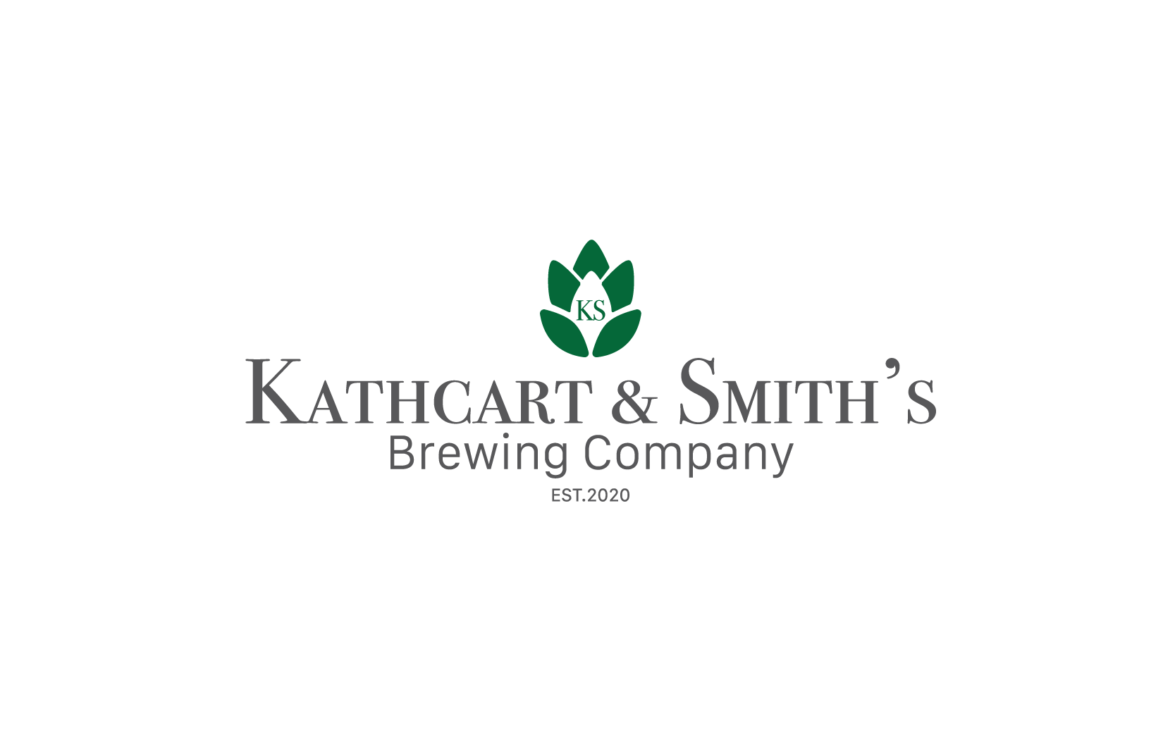
Kathcart & Smith’s
For Kathcart and Smiths Brewing, the brand design focused on evoking a sense of tradition and authenticity. The warm and rustic colors used in the visual identity reflect the company’s commitment to quality and craftsmanship. The logo features a nod to the brewing industry, with a hop cone and barley stalk incorporated into the design. The overall result is an eye-catching and memorable brand that stands out in the competitive world of craft beer. From the taproom to the retail shelf, the Kathcart and Smiths Brewing brand is instantly recognizable and resonates with beer enthusiasts who appreciate the artistry of a well-crafted brew.

Problem:
Kathcart & Smith, a brewing company, is facing a branding problem. The issue is that the company’s name is not very memorable or unique, which makes it difficult for customers to remember and identify with the brand. Additionally, the name itself does not convey any information about the product or the company’s values. This lack of brand identity could lead to a lack of customer loyalty and difficulty in standing out in a crowded market. The company needs to develop a strong brand identity that resonates with customers, communicates the company’s values, and distinguishes it from competitors.
Solution:
To overcome the branding problem faced by Kathcart & Smith, the company needs to develop a comprehensive branding strategy that highlights its unique selling proposition, values, and mission. This can be achieved through market research to better understand its target audience and their preferences. Refining brand messaging and visual identity will help to create a strong and consistent brand image. Leveraging social media and community engagement will help build brand awareness and loyalty. This will differentiate the company from its competitors and establish a lasting connection with its customers, leading to improved sales and growth prospects.
My Role:
As the graphic designer in charge of branding for Kathcart & Smith, I played a critical role in developing a visual identity that resonated with customers and communicated the company’s values. Using my creative skills, I designed a logo, packaging, and marketing materials that distinguished Kathcart & Smith from its competitors and helped establish it as a leading player in the brewing industry. My work as a graphic designer helped the company improve sales and growth, and develop a strong brand identity that resonated with customers.


Websites


