John’s Tacos
John’s Tacos is a popular restaurant that serves mouth-watering tacos with a variety of fillings, featuring fresh and flavorful ingredients. The menu offers options for all tastes, from classic beef tacos to vegetarian options. Customers rave about the generous portions and affordable prices, making John’s Tacos a go-to spot for a quick and delicious meal on the go. The tacos are made with warm, soft tortillas stuffed with juicy meats and fresh salsa, making them stand out from the competition. John’s Tacos is a must-visit for anyone who loves delicious and authentic Mexican food.

Problem
Creating a brand for a company called John’s Tacos can be a challenging task. The brand needs to capture the essence of the company and set it apart in the highly competitive food industry. The brand design needs to appeal to the target audience and convey the company’s values and personality. It is important to consider the color palette, typography, and graphics that will be used in the brand design. The brand needs to be easily recognizable and memorable, and it should evoke a sense of trust and authenticity in the minds of consumers. Overall, creating a successful brand for John’s Tacos requires careful planning, research, and creativity.
Solution
As a graphic designer, my role in creating a brand for John’s Tacos would be to develop a visual identity that effectively communicates the essence of the business to its target audience. This would involve understanding the company’s values and message and translating them into a design that captures the attention of potential customers. A successful branding solution would convey the uniqueness of John’s Tacos, differentiate it from competitors, and establish a strong emotional connection with the audience. Whether it’s through the choice of colors, typography, or imagery, the brand design must be memorable, eye-catching, and consistent across all platforms to create a cohesive and recognizable identity.
My Role
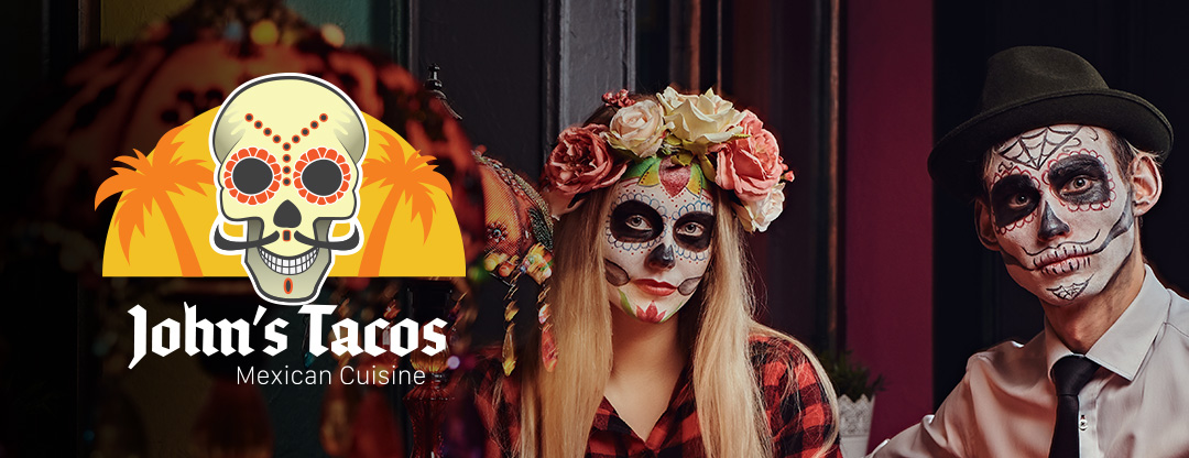
The brand design for John’s Tacos was created with the aim of capturing the fun and lively atmosphere of the restaurant. The logo features a playful and colorful illustration of a taco, with bold and modern typography that emphasizes the name of the restaurant. The color scheme consists of bright and bold shades of orange, yellow, and black, which complement the warm and inviting vibes of the restaurant. The overall design is memorable, eye-catching, and appeals to the restaurant’s target audience of young and urban customers. By creating a visual identity that captures the essence of the business, the brand design for John’s Tacos helps to establish a strong and recognizable presence in the market.

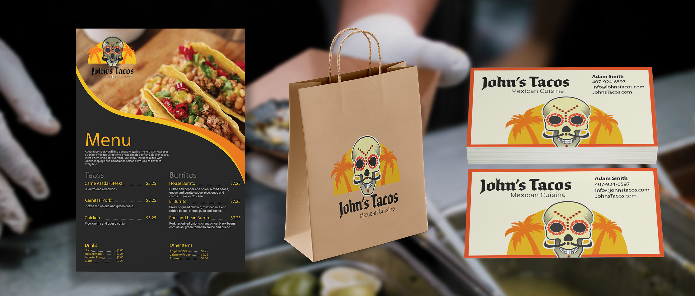
John’s Tacos menu design, To-Go bag, and business cards.

